Research & Concept
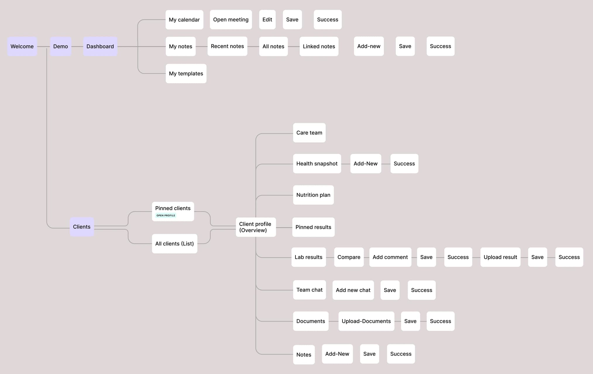
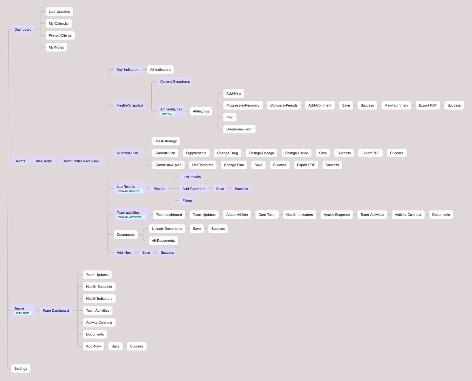
Idea search and research: a jobs-to-be-done board, a synthetic interview against it, flows and the end-to-end product map.
team
care
made
simple
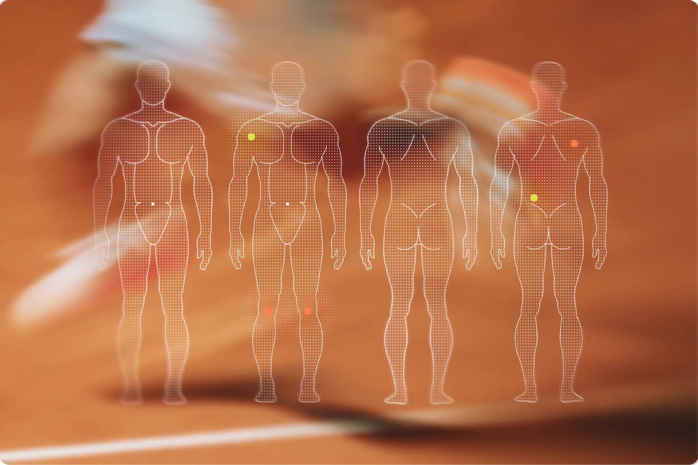
Suppo keeps an athlete’s health and recovery data where their doctor, nutritionist and coach work. Key indicators, the plan and the team’s latest notes sit on one screen – an athlete’s state reads at a glance.
Aline Willas
Plan High Protein 3000 Kcal
Weekly checklist
Suppo comes from my own story: I trained with a nutritionist and a coach at the same time. The two of them never spoke, so I became the link between them – lab results one way, the training load the other, my history retold at every intake. Neither of them ever saw the whole picture.
The same gap runs through every team around an athlete. The doctor holds the diagnosis, the nutritionist the plan, the coach the load – each does their job well inside their own fragment. Nothing makes the three a team, and the athlete pays for everything that slips between them.

Suppo brings doctors, nutritionists, coaches, and athletes into one shared space. Health data, notes, recommendations, and progress stay connected, so the whole team works from the same picture.
When I work with several specialists, I want them to see the same information, so that I do not have to repeat my story many times.
When I return to training after an injury or health issue, I want to understand what has improved and what still needs attention, so that I can avoid repeating the same injury.
When I have many athletes, I want to quickly understand who needs my attention first, so that I can focus on the most important cases without wasting time searching.
When I analyze an athlete’s condition, I want to compare lab results, symptoms, sleep, and recovery data in one place, so that I can better understand the reason for poor progress or recovery.
When I work with a nutritionist on the same athlete, I want to see their recommendations in one shared profile, so that I can make decisions with the full context.
Before drawing screens I mapped the product end to end. The first map came out of the jobs-to-be-done board and a synthetic interview I ran against it – twelve jobs, every section, every path through the product.
Then I sat down with the people who would use it: a nutritionist who carries eleven clients at once, and the assistant who does all the data work in her practice. I screen-shared the prototype and watched. The map changed after the calls: the structure came out simpler, and the second version is the one the product follows.
“Why separate information out for the team, if we are all working toward the same goal anyway?”
“Maybe there should be a shared chat from the very start – the client answers in it, and the doctor too. That seems more practical than what is here.”
“I don’t work from a computer, I work from the phone. I live in Turkey – we drive out for breakfast in the mountains, I connect for a minute and it’s done. Or we go out for a picnic, a task comes in, I finish it and go swimming.”
“There is a site where you convert the values. I type each one in by hand and convert it.”
The team section came out of the product whole. The conversation moved into the client’s profile, next to the data it is about – a group for the case, or one person on their own.
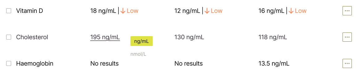
Both of them convert lab units by hand through an outside site. In suppo a value and its reference range switch systems together, mg/dL ↔ mmol/L. The stored value never changes – the conversion is display only.
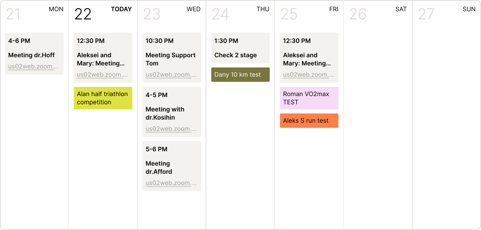
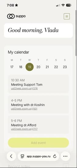
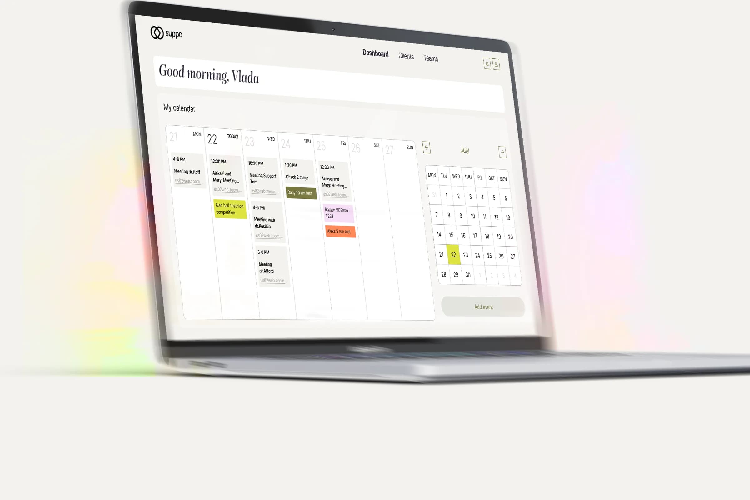
The nutritionist opens the schedule several times a day. Meetings pulled in automatically read at once, so the week calendar took the top of the dashboard and the update feed came off it.
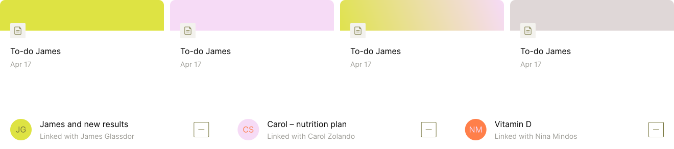
On the dashboard the notes block read as a to-do list. Inside a client’s profile the nutritionist named it correctly with no prompt. Notes went where they were understood: linked to a client and shown on that client’s page.
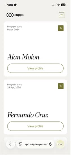
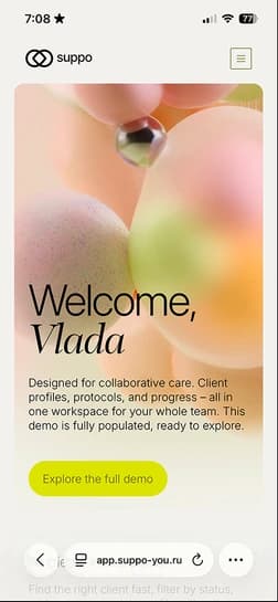
I drew suppo for the desktop. The person who enters every value works from an iPhone by choice. I rebuilt the working screens for the phone: dashboard, client profile, chat, and the lab table as an accordion.
Idea search and research: a jobs-to-be-done board, a synthetic interview against it, flows and the end-to-end product map.
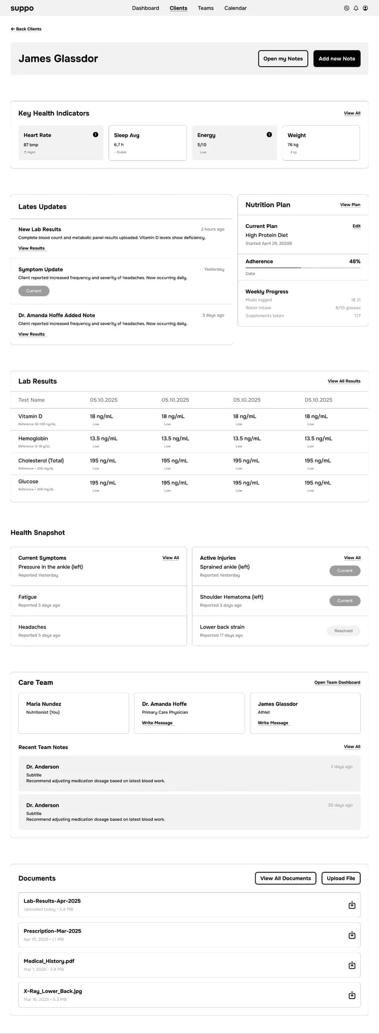
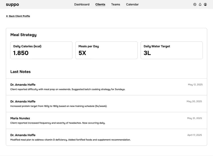
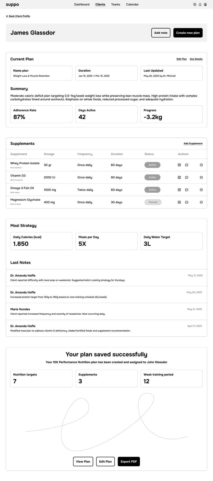
The second map became wireframes, the wireframes became screens: client profile, nutrition plan, lab results, clients list, the note dialog. The originals close this page.
A design system holds the interface together: color and type tokens, one kit of components. This page runs on the same tokens – the background and the type below the meta table come from the product.
Tokens went into code first, then the screens: a database, PDF uploads parsed into the lab table, deploy on its own domain, a security audit. Every visitor edits their own copy of the demo world, scoped to a session cookie.




Personal dashboard
The dashboard opens on the week – meetings with their call links, events highlighted in color. The month calendar beside it switches the date, so planning stays on one screen. The day card beside the screen pulls one day into focus. Open Demo runs the live product.
12:30 PM
Aleksei and Mary: Meeting Support
us02web.zoom.us/j/8
Roman VO2max TEST
Aleks S run test
Three recordings of the live product: switching days of the week, opening a meeting with its call link and guests, opening a test with its protocol.
Add note
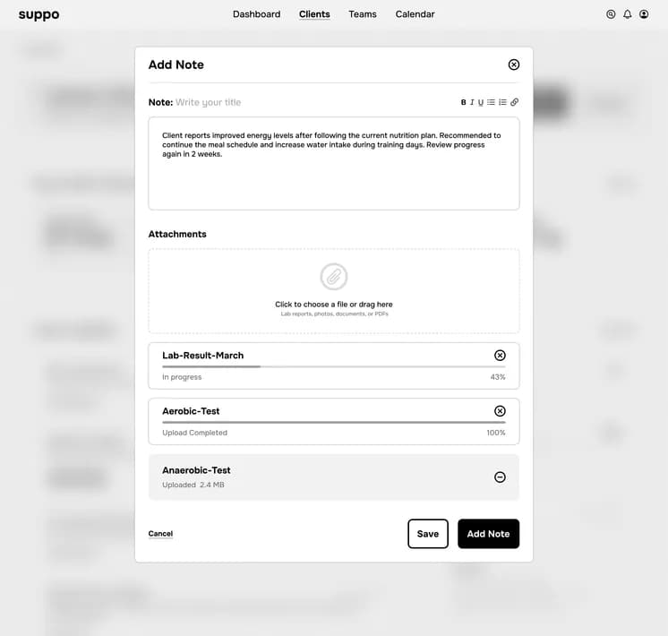
A note opens in a modal over the current screen: type it, attach files, link it to a client. The field below sorts the notes itself: the freshest hang in Recent as covers, then settle into My notes; notes linked to a client also show up in that client’s profile, so their page carries everything written about them. Three groups – three ways back to what you wrote.
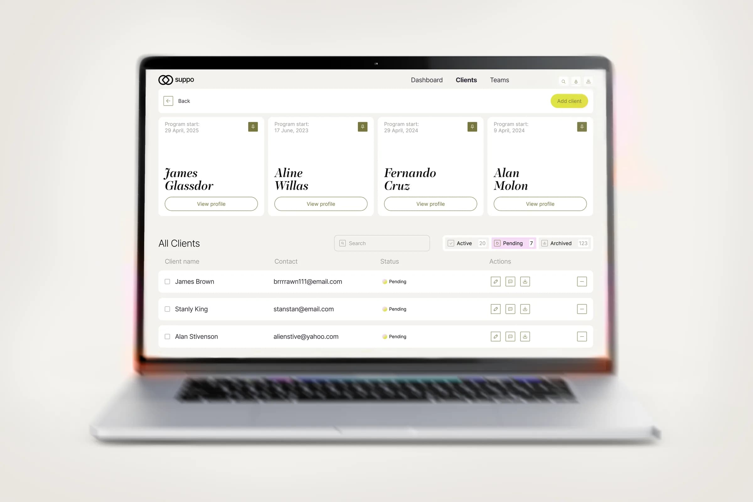
All clients in one place
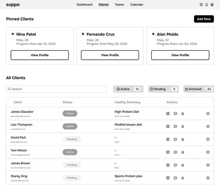
The clients you see daily stay pinned: their cards sit on top of the list, the profile one click away – no searching the full list. Everyone else filters by status – Active, Pending, Archived – so the list stays short even when the practice is not.
Talk where the client is
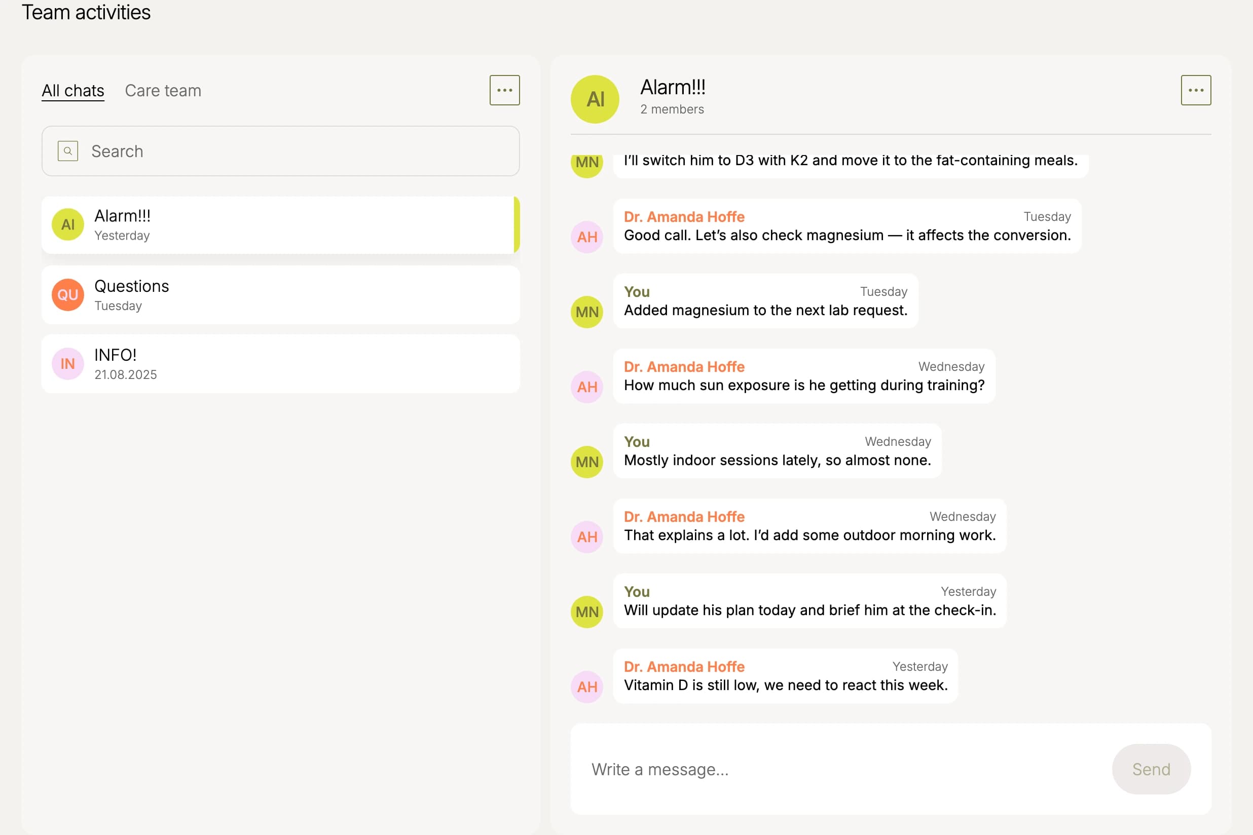
The chat sits in the client’s profile, under their data. Open a group for the case with the doctor and the coach, or write one person on their own – the Care team tab lists everyone on the case, and Write message starts the thread.
Key results, clear progress
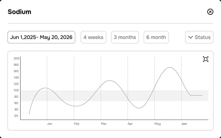
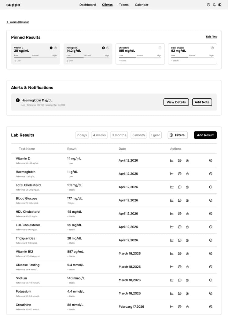
The tests that matter stay pinned: cards above the panel hold the latest value, so the markers you watch are always in front of you. The panel underneath is the same data from other angles – the full history in a table, one test as a chart over time, any value in either unit system. Converting units happens in the row, reference range included: in the interviews, every value took a trip to an outside site and back. That trip is gone. All of it works right here.
16 ng/mL
132 mg/dL
164 mg/dL

app.suppo-you.ru
The demo runs on its own database and domain, parses lab PDFs straight into the table, and went through a security audit. The prototype was tested with practitioners, and their feedback became the changes listed above. Designed and vibe-coded solo.

28 ng/ml
An expressive serif, set in italic. It appears in headings only, one accent per card – everything else on the screen is Inter.
Inter carries the interface: headings, tables, values, captions. Variable 100–900, so weight alone builds the hierarchy – from 60 px down to 12.

Wireframes of the product: client profile, nutrition plan, lab results, clients list and the note dialog.

take care

 Search