RamSoft – cloud PACS/RIS platform for radiology

- Context
- Client project – RamSoft, Toronto
- Industry
- Healthcare SaaS / Radiology
- Product
- Cloud PACS/RIS platform – radiology image archive, reporting and workflow
- Role
- In a team – UX/UI design and brand identity: site, print, events
RamSoft’s single, AI-powered platform keeps sites, specialties, and systems connected – supporting your growth today while scaling effortlessly for what’s next.


problem
The site was live and it had a design, but no system under it: every page had been drawn on its own, and templates shared neither spacing nor a type scale. Parts of the new identity had already been applied, and they pulled away from it. Because the job read as half done, no development time was budgeted to rework pages – the CMS and templates stayed, and the brief covered a visual refresh.
solution
We read every page, collapsed the variants of one block into a single component, and drew new components where repeating content had none. Underneath went what the site never had: a type scale, a spacing grid, a palette and a new icon set. Composition and hierarchy took the most work – that’s where pages had drifted furthest apart. The identity then came in through the system, and the templates stayed as they were.
design system
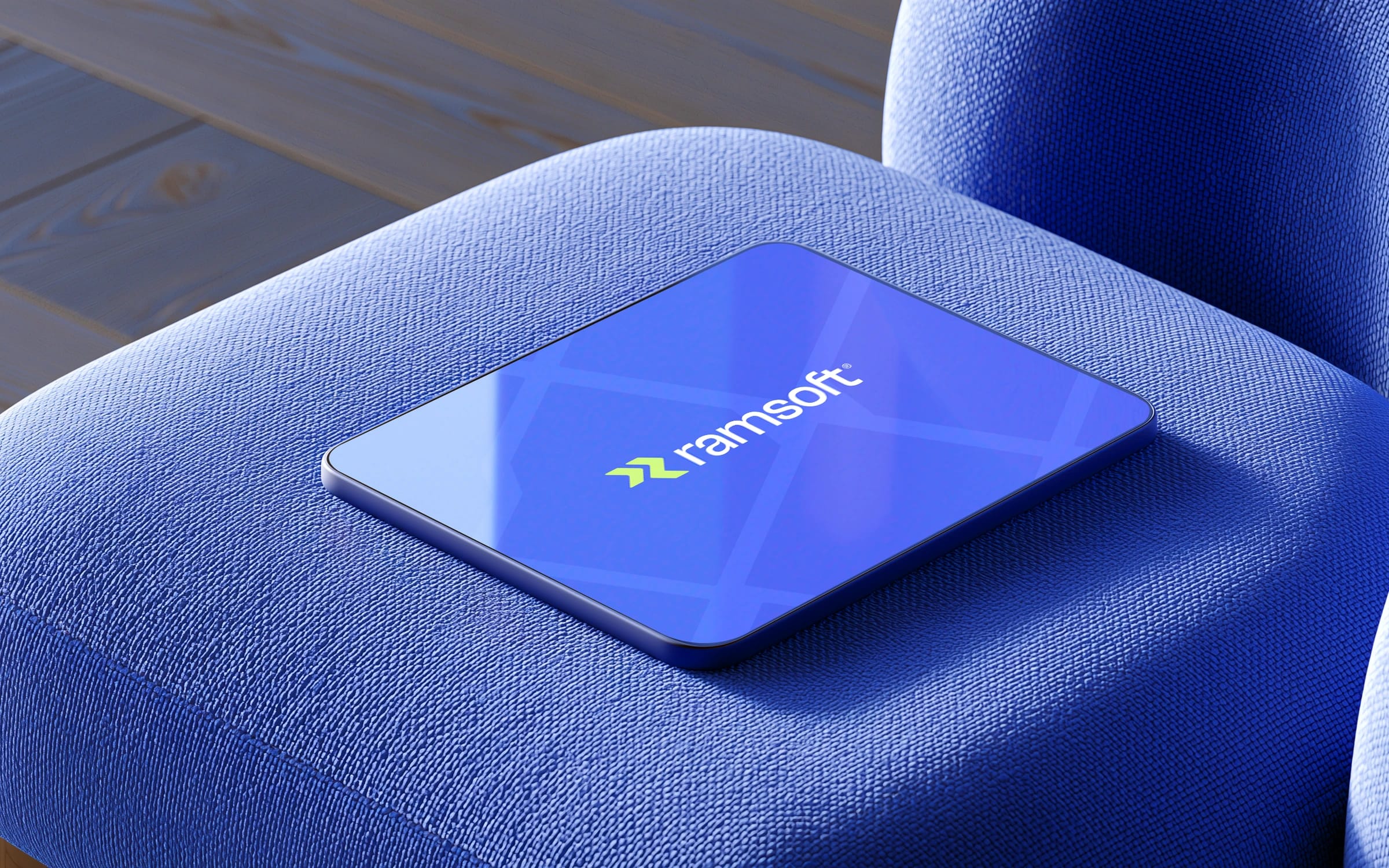
One type scale, one spacing grid, one palette, one icon set – every repeating block on the site became a component.
A new page is assembled from existing parts instead of drawn from scratch, and the identity holds across products, pages and content types.
Welcome to the AI-powered platform
typography
Users read only 28% of a web page
*Nielsen Norman Group, 2008
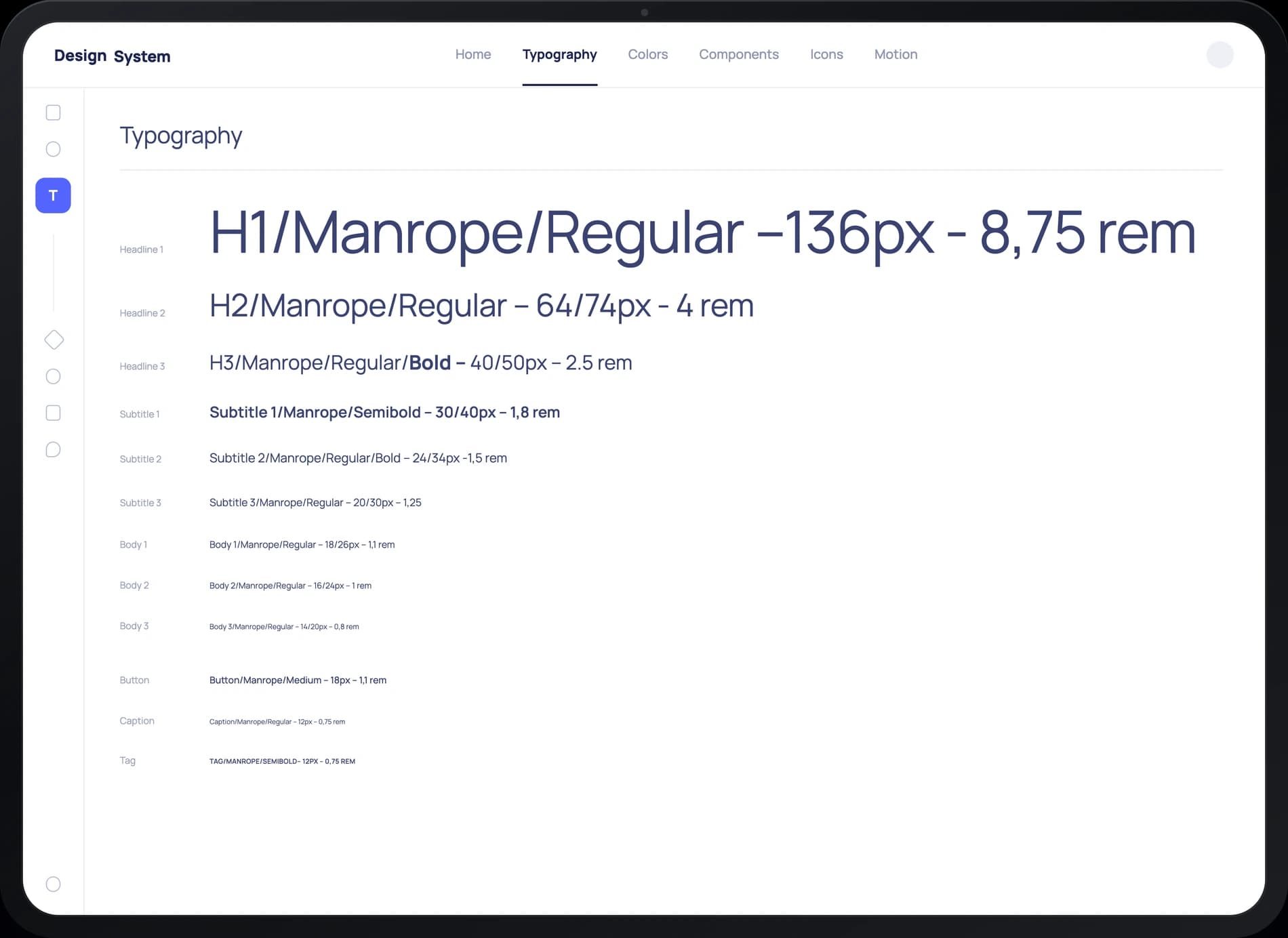
So the pages are built for scanning: headings carry the point on their own, and a strict Manrope scale keeps the hierarchy readable at a glance.
Manrope’s precise geometric forms give RamSoft’s digital identity a modern and confident character.
12 styles
colors
White
HEXFFFFFF
Burple
HEX5465FE
Dusk
HEX393E6C
Link Water
HEXDDE2EE
Lime Green
HEXCFFA50
ai vendors
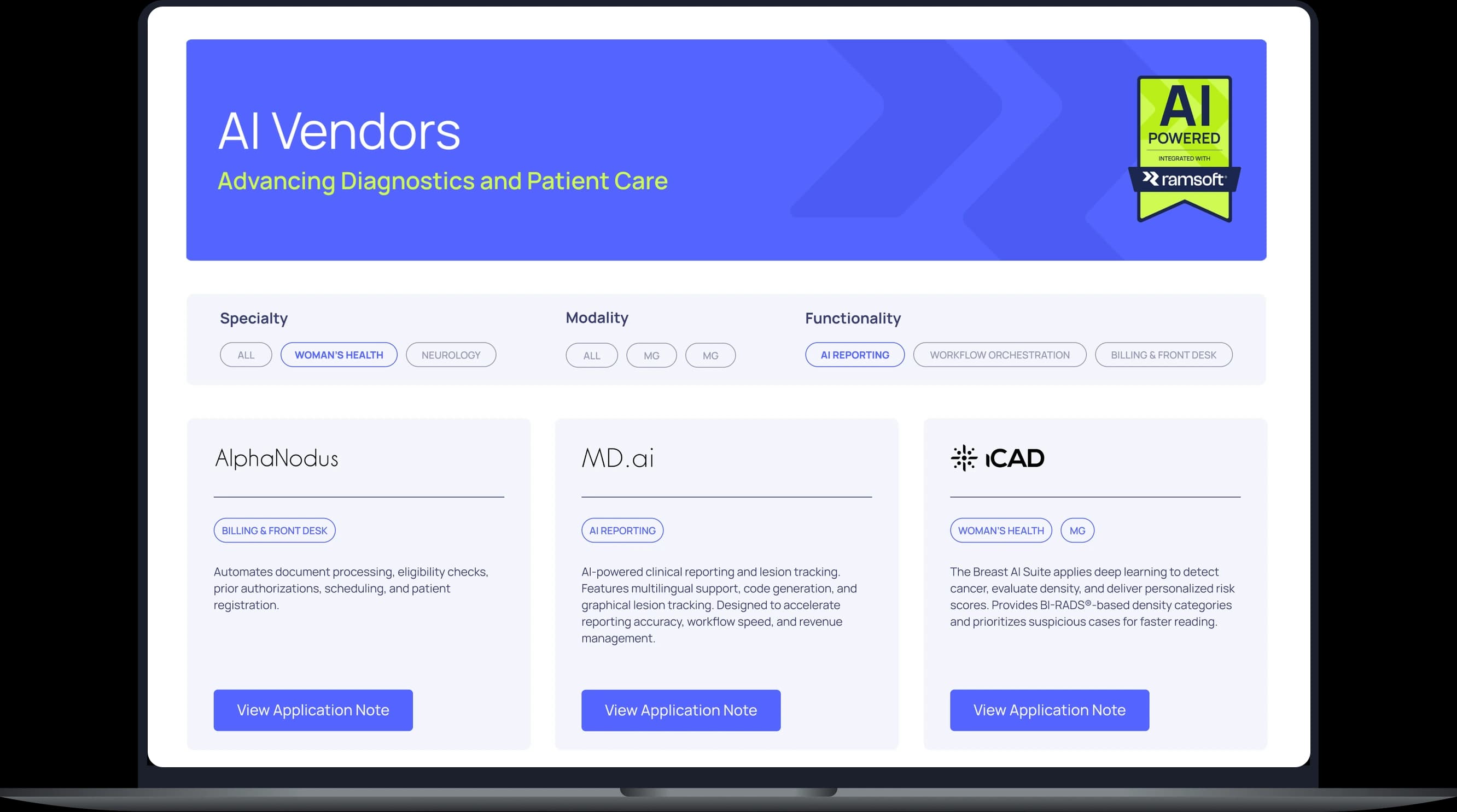
Vendor cards carry tags, so the area a vendor works in reads straight from the card. The search splits by the same areas – one less menu to open.
Readers stay: 3m 04s per visit against the site’s 28s average, 3.5 views per person.
learning platform
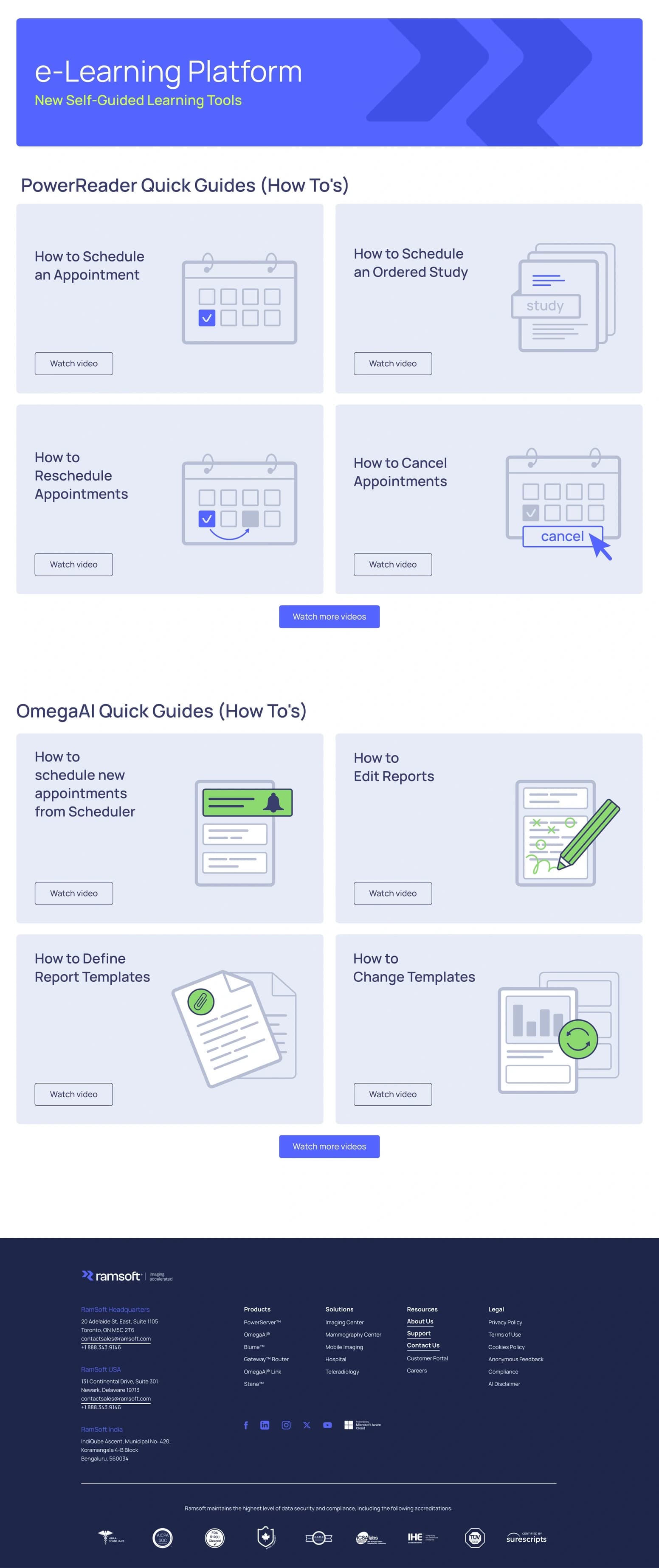
A library of video guides about the product. Covers are drawn illustrations that show what each video is about – the tiny screenshots nobody could read are gone, and illustration sets the section apart from the photo-led pages around it.
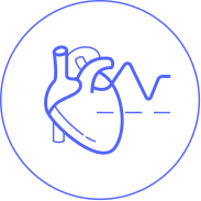
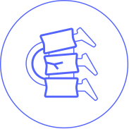
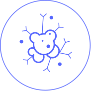
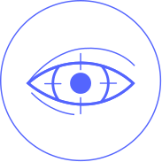
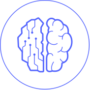

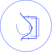
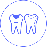

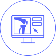
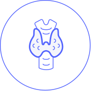
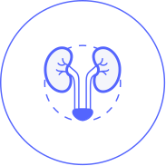
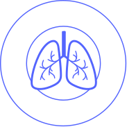











The old icons came from stock libraries – mixed styles, some of them JPEG, and several that did not match the text beside them.
We drew the set from scratch in a single line style and checked every batch with the sales and product teams. The set outgrew the site: events, sales material and client documents run on the same icons.
50 icons, three sizes
White version



Dark version

Radiology blog
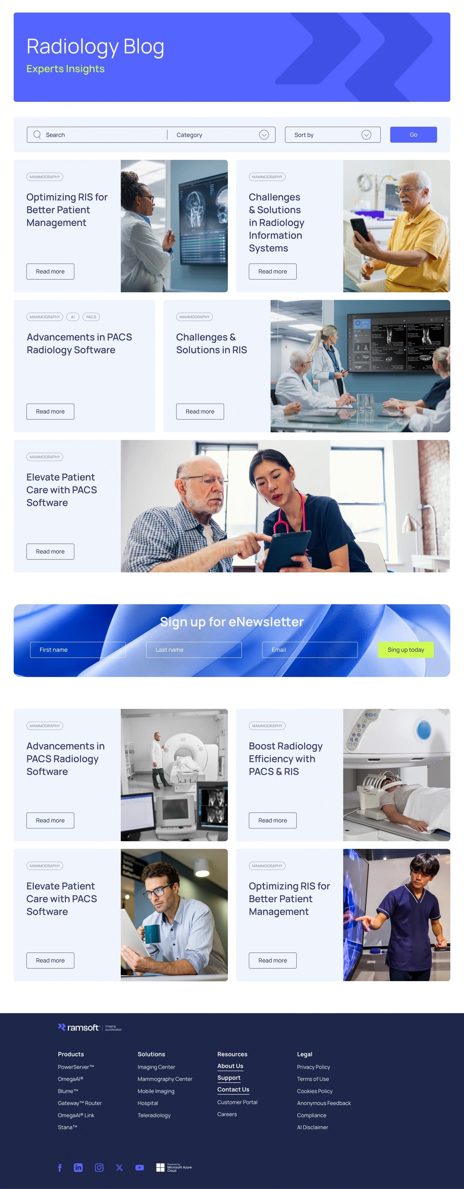
The old blog ran everything at one weight: long reads nobody finished, stock photos matching neither the article nor the brand, and a page that converted poorly.
We rebuilt the structure and gave every article a cover that belongs to it. Cards take different sizes and a new one can run the full width, so the page picked up a rhythm as it grew.
Promo blocks sit inside the flow – scroll far enough and a bright card surfaces with what the team wants to push.
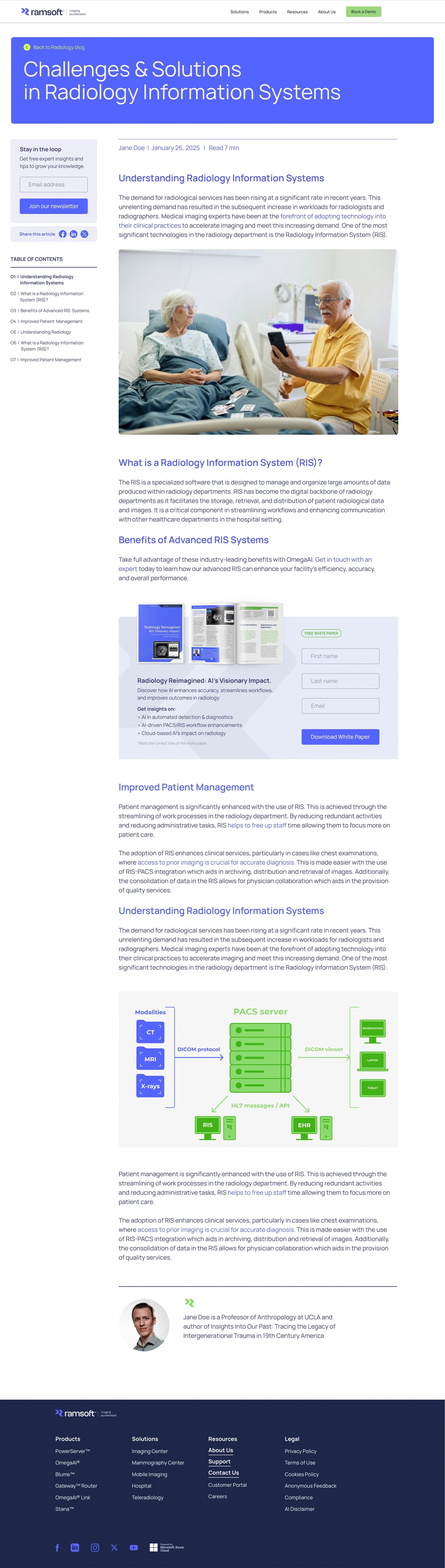
A contents list runs down the left side of the article. A reader sees the shape of the piece before committing to it, and jumps straight to the section they need.
Infographics and photographs break up the science. We reworked the type for reading: headings stand clear of the text, and every block has room of its own.
Promo keeps the same rhythm – a newsletter box in the sidebar, a white paper form between sections.
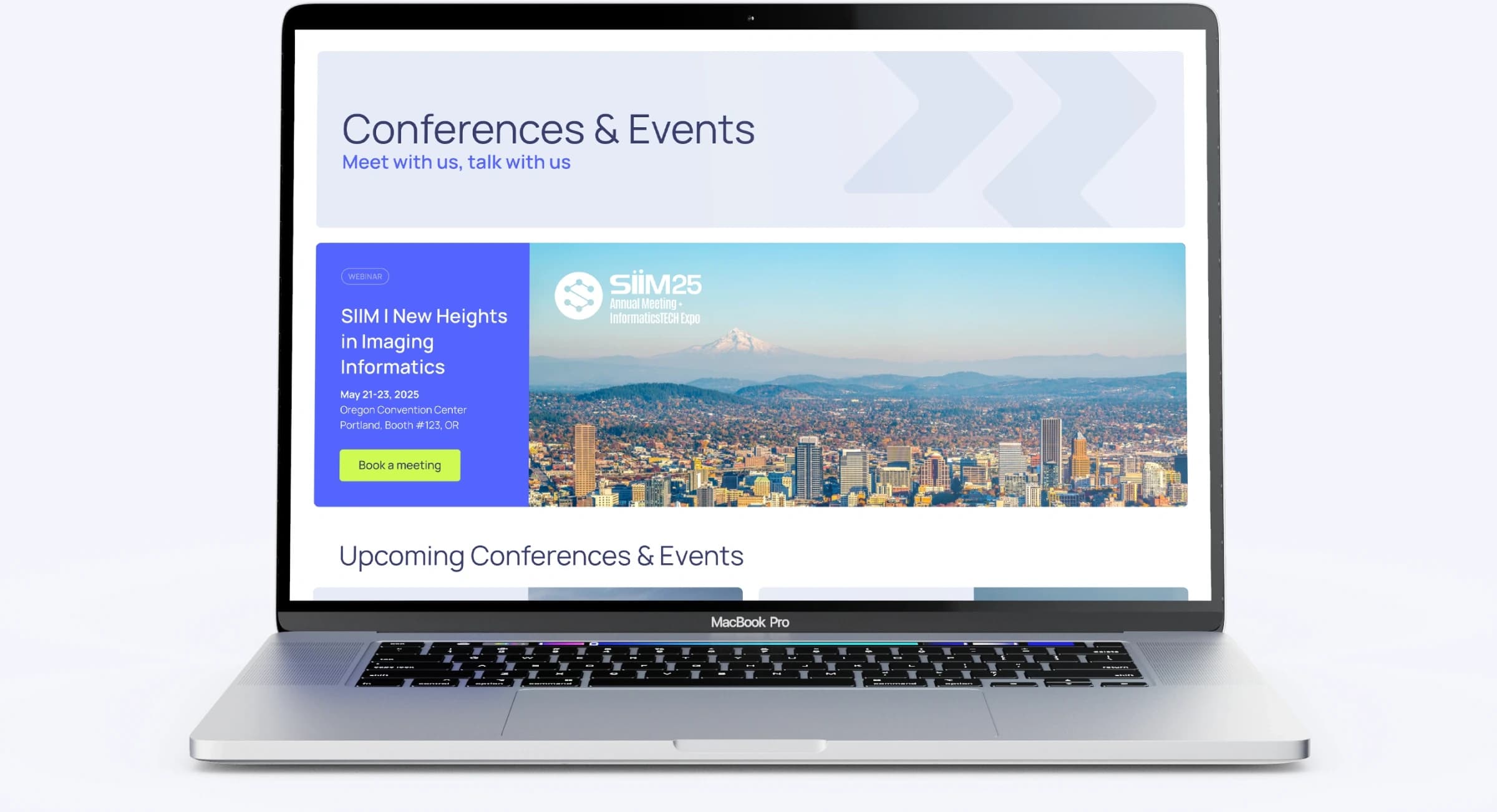
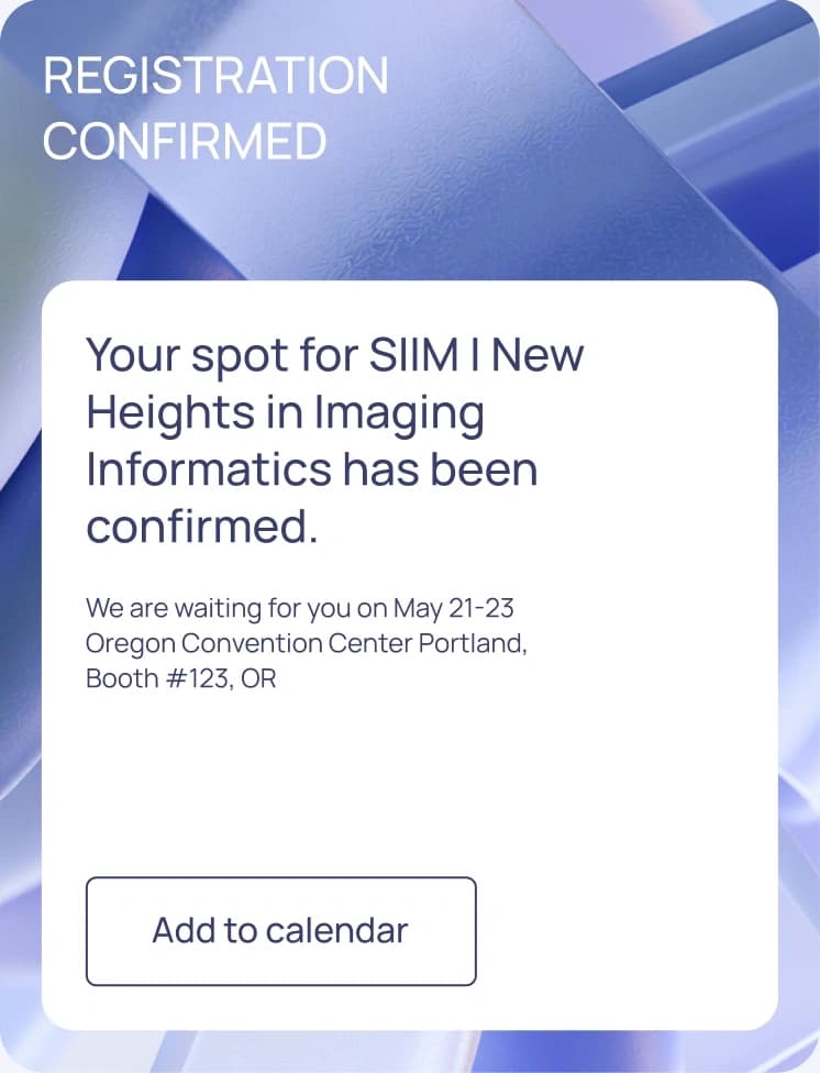
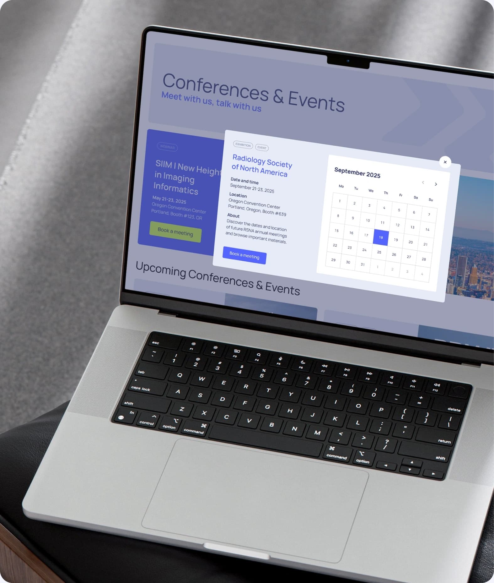
event page

The redesigned blog holds a reader 51% longer than the site average.
Google Analytics, engagement per active user across 70,000 blog views: 42 seconds against the site’s 28. The pattern repeats through the sections: the AI landing reads 82% above the site average, the download center 63%, the partner catalogue six times.
Social media
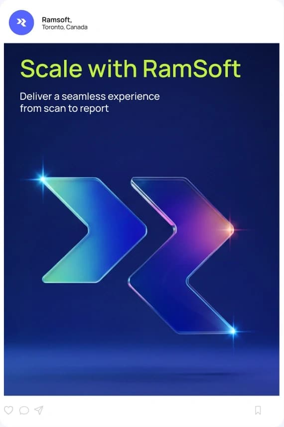


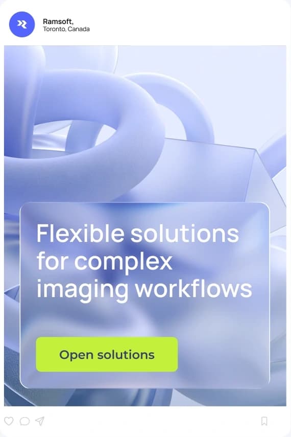
Three months of LinkedIn: 104,745 impressions, up 23.5%.
Merch